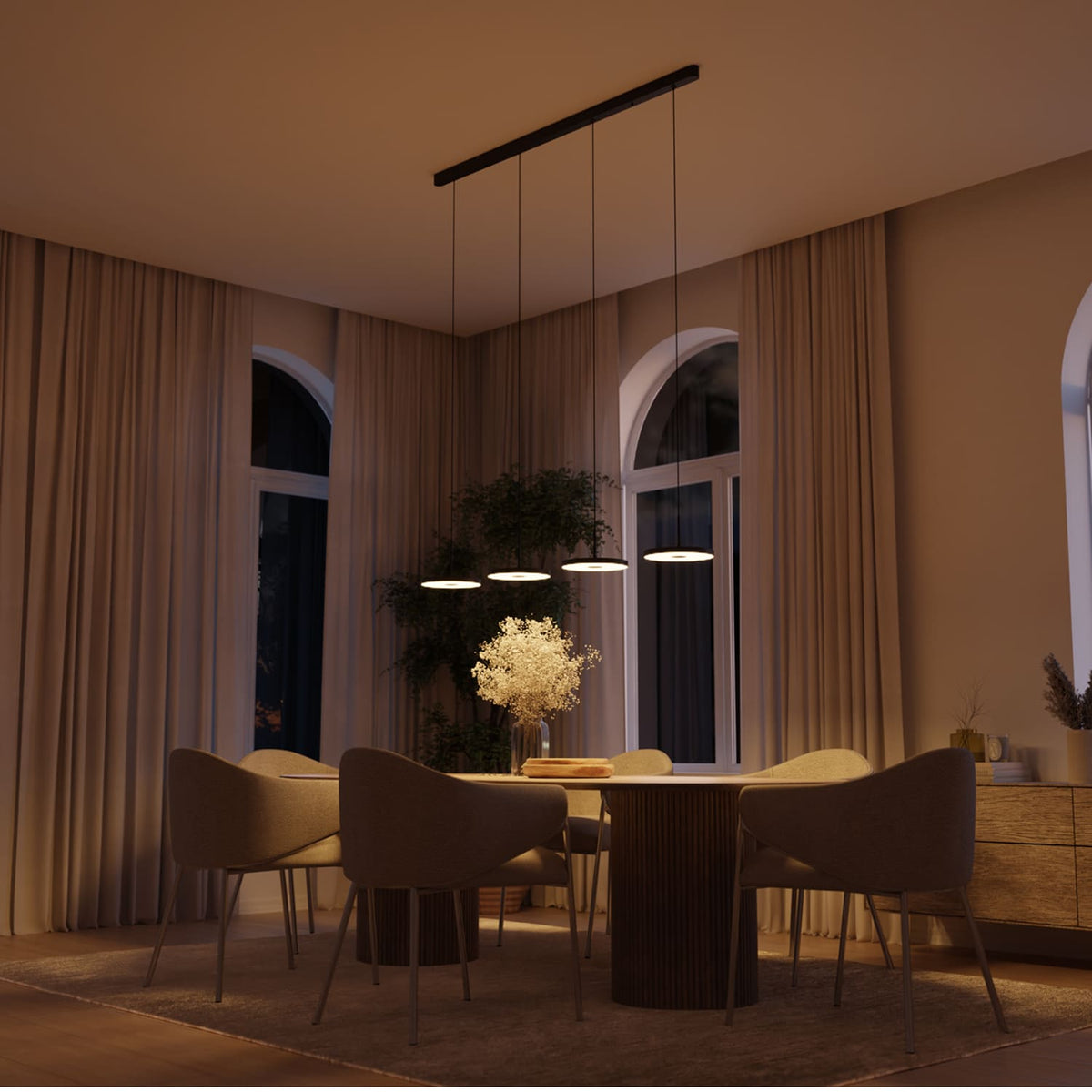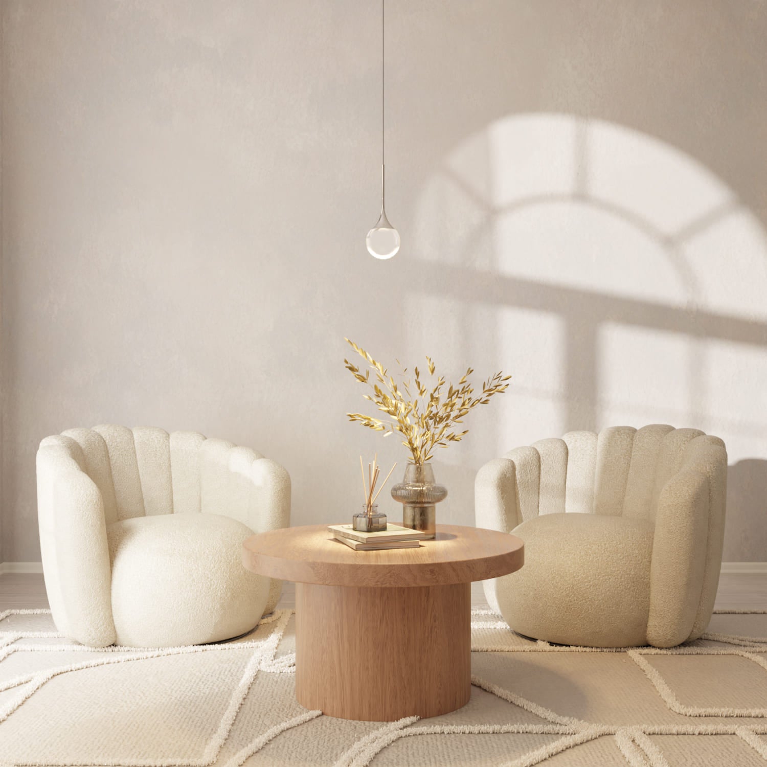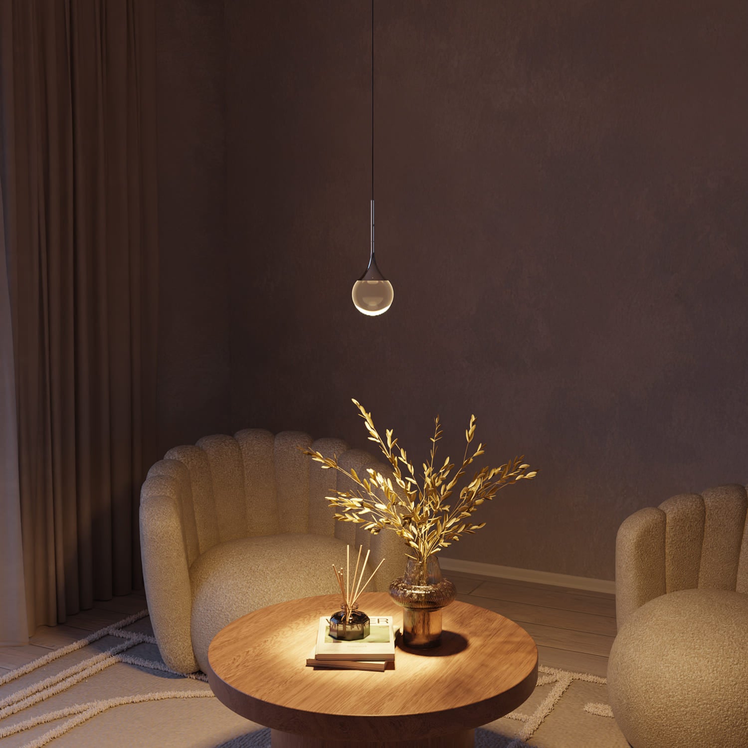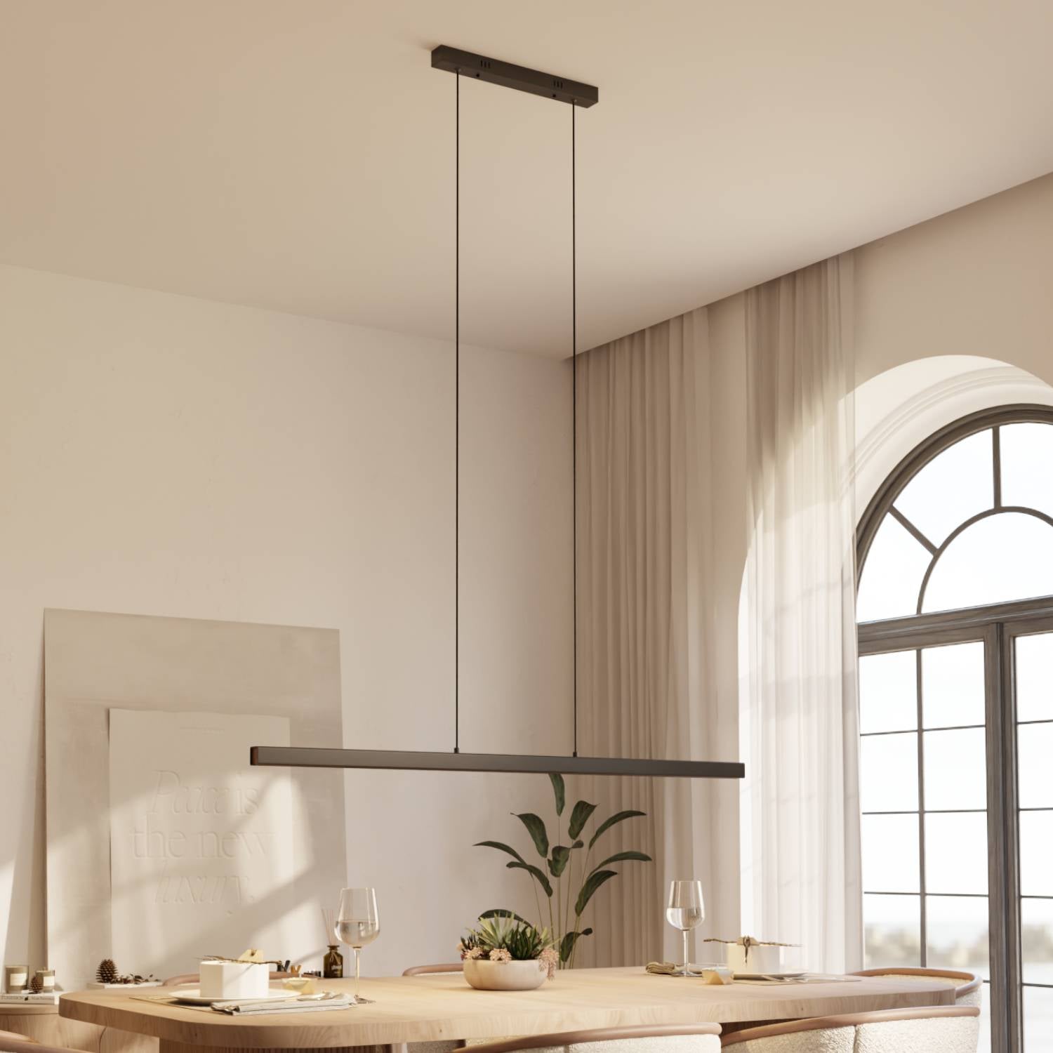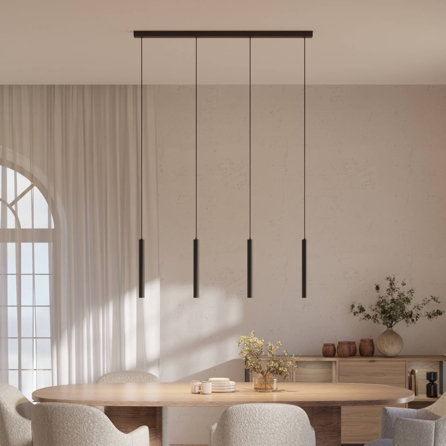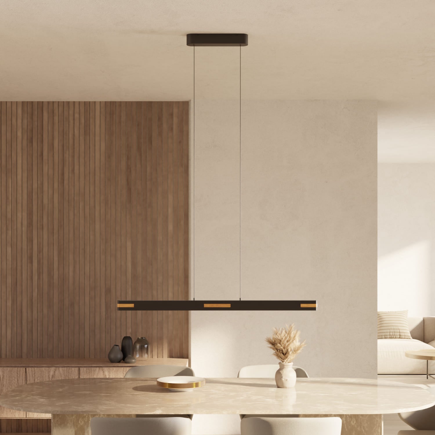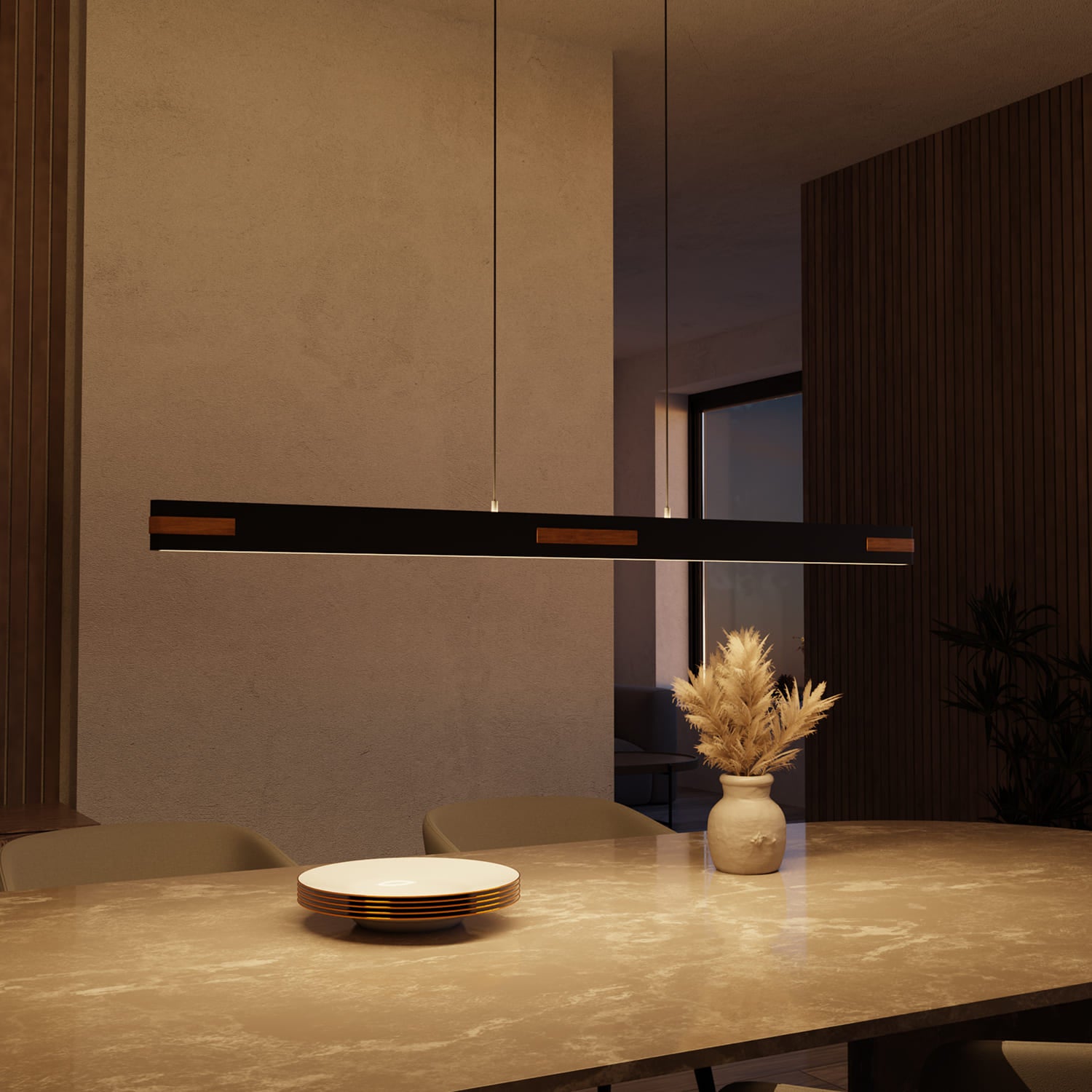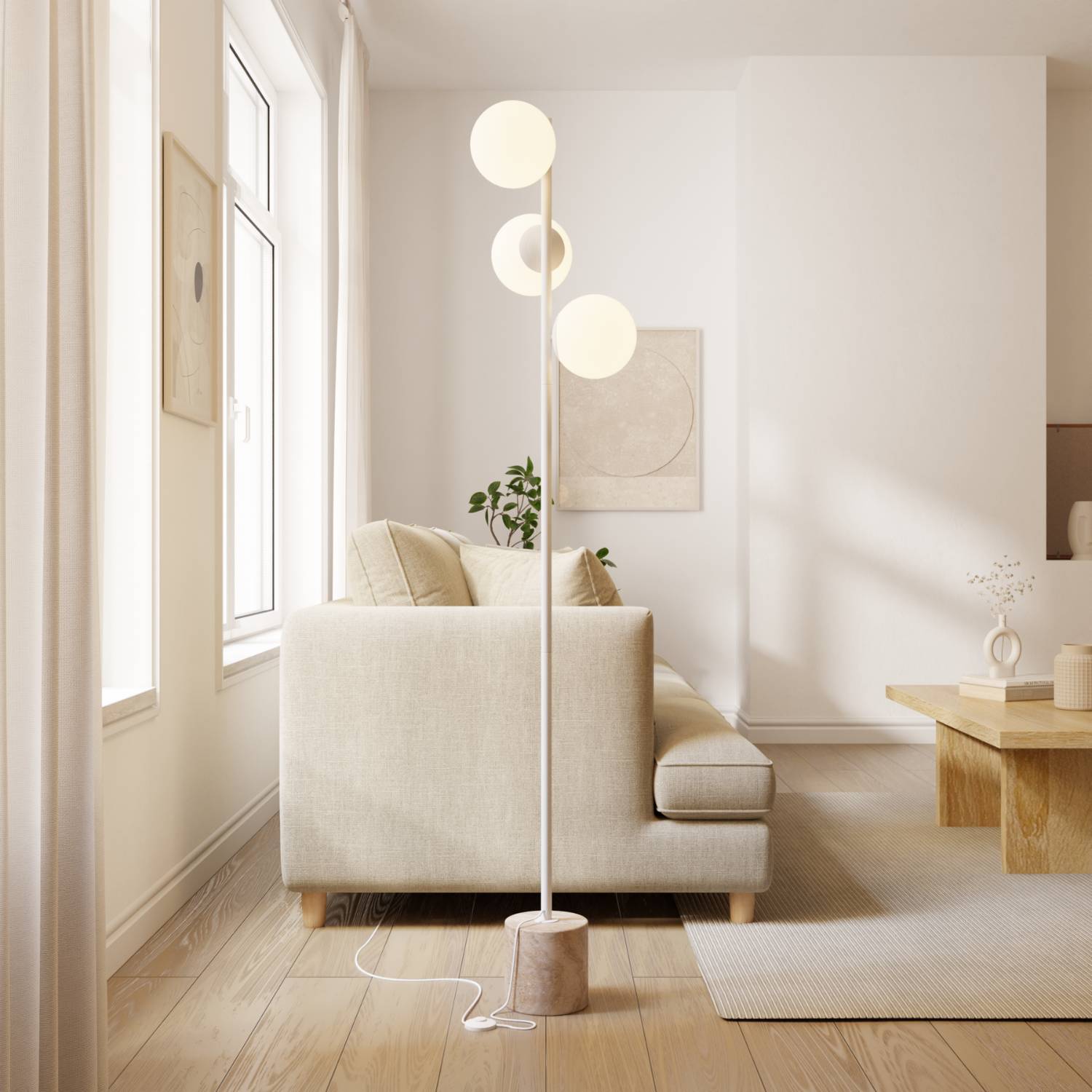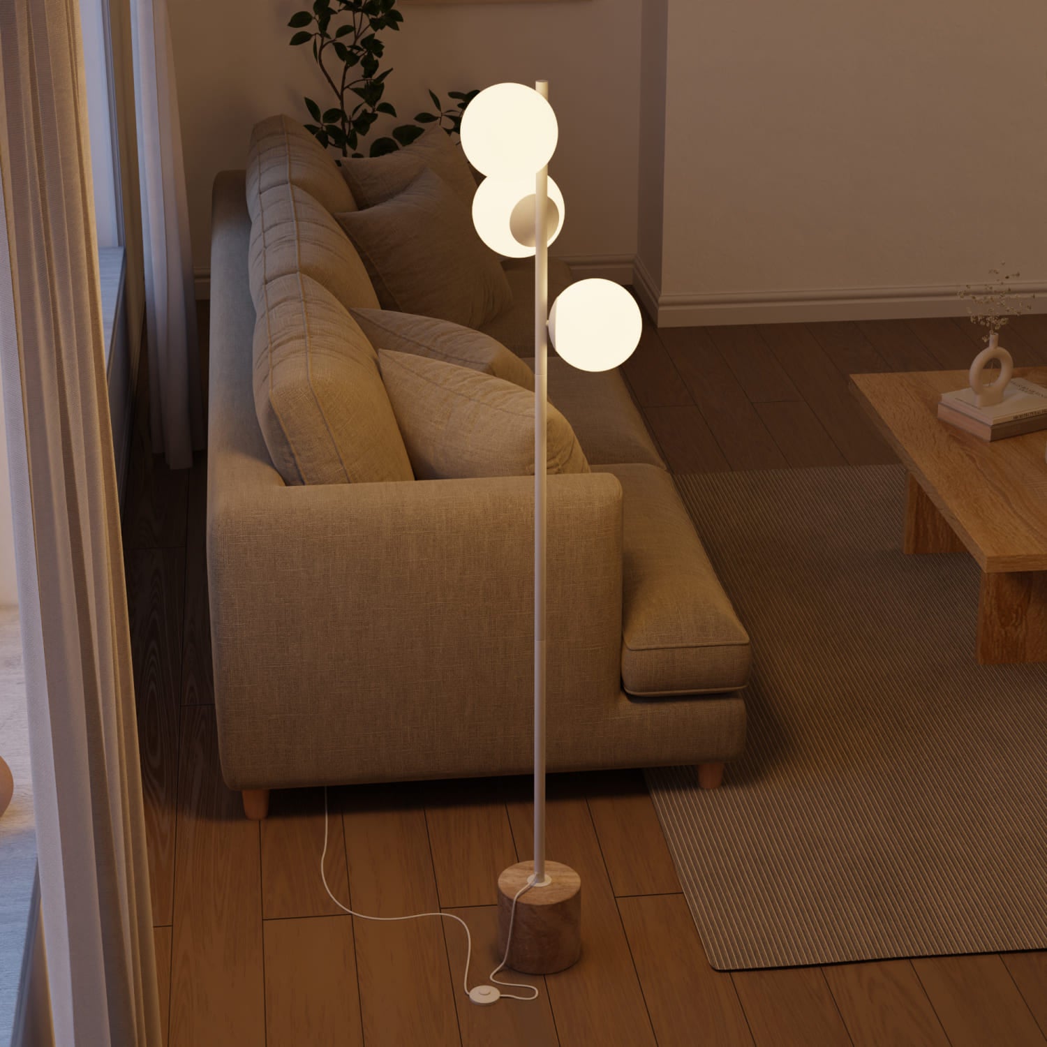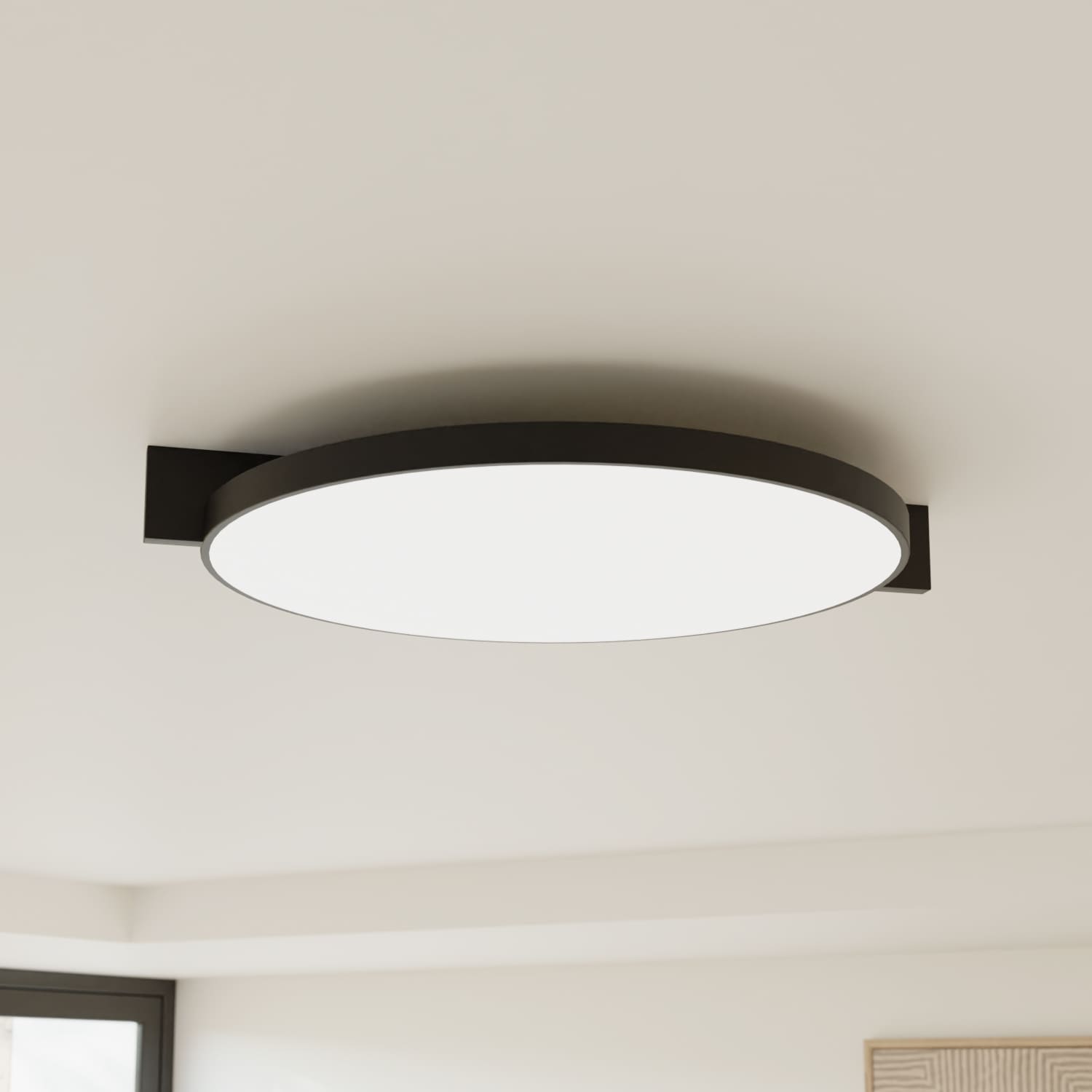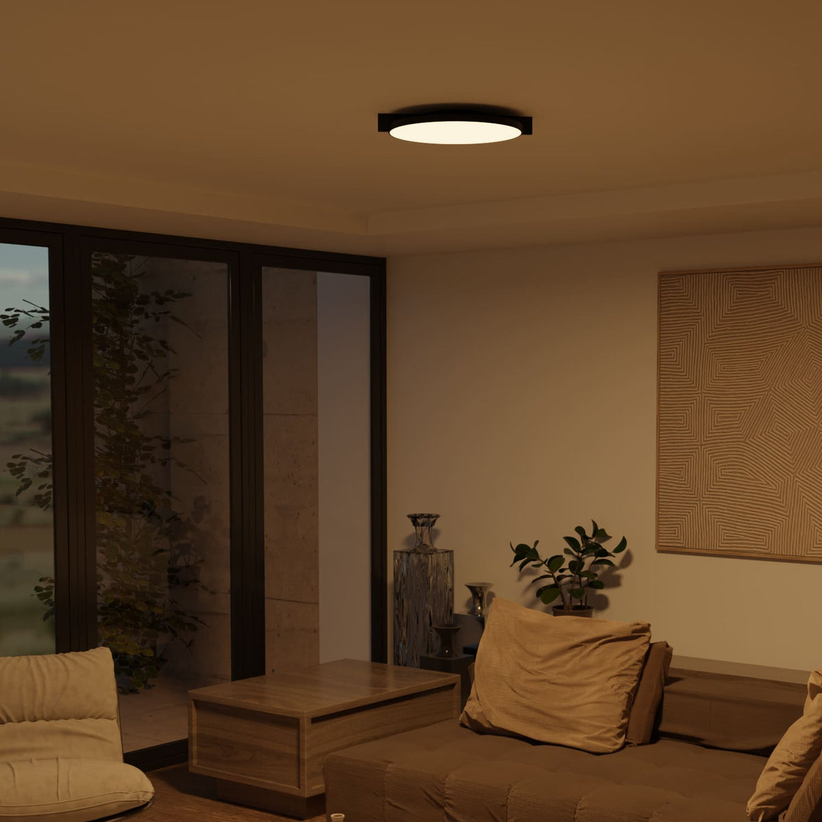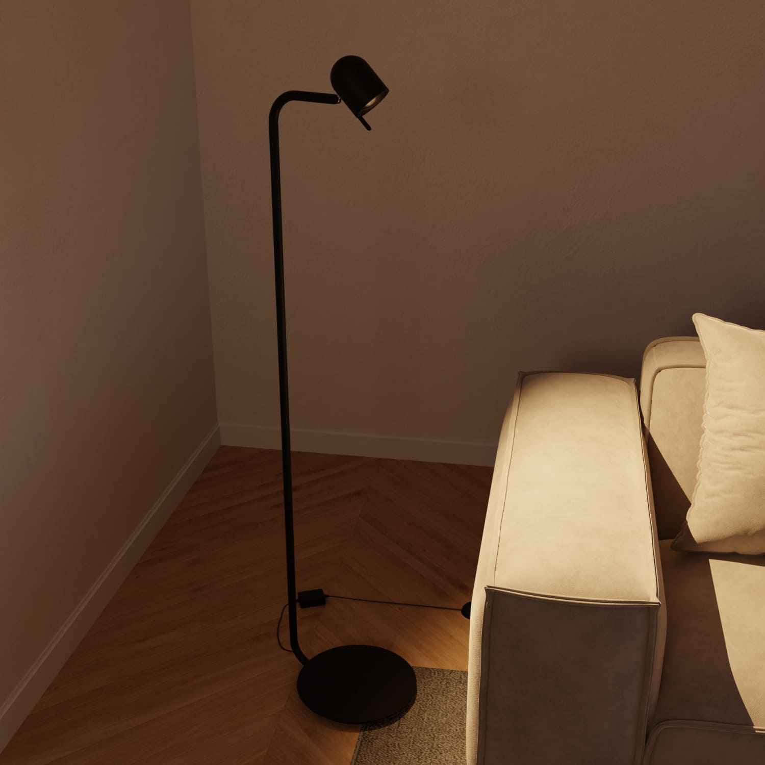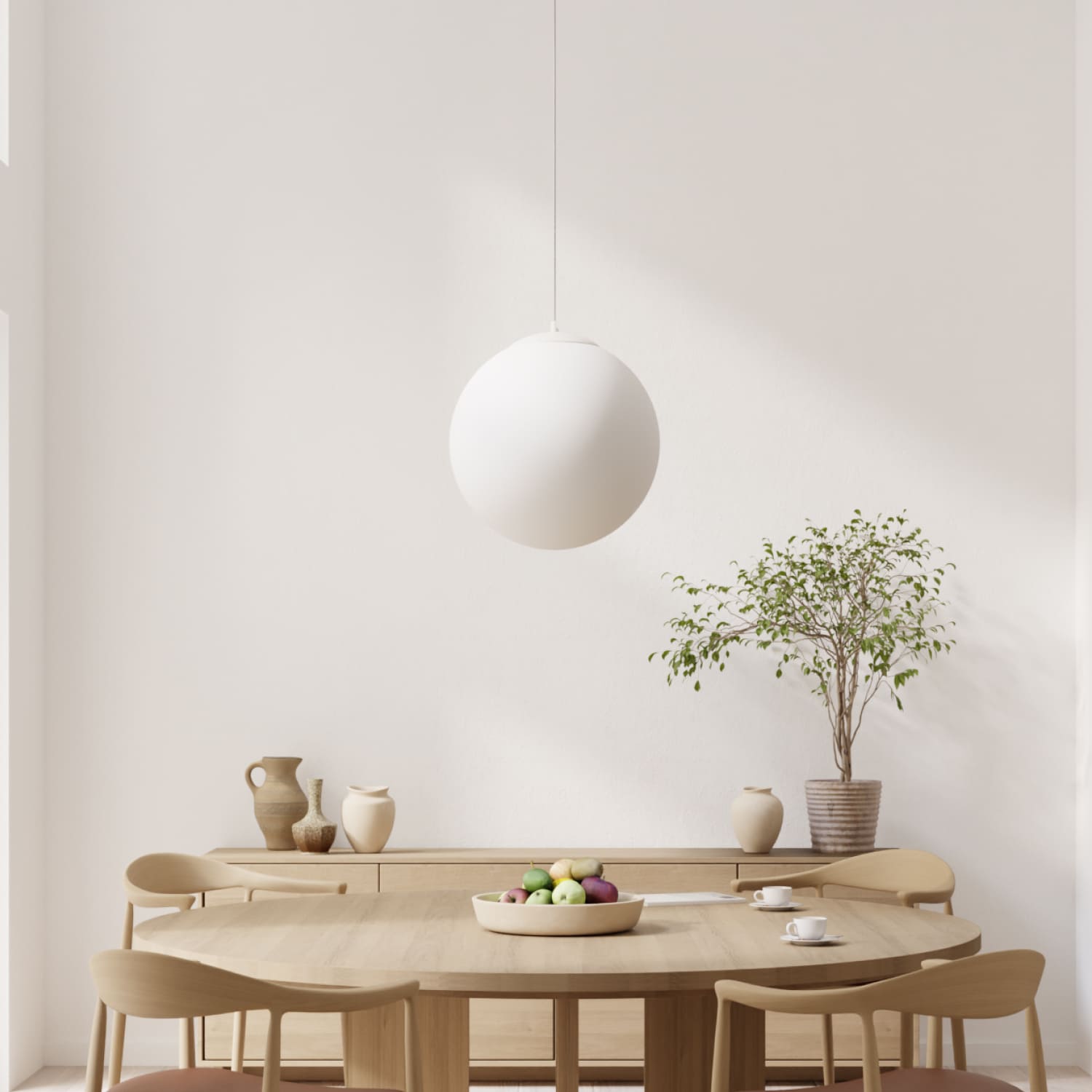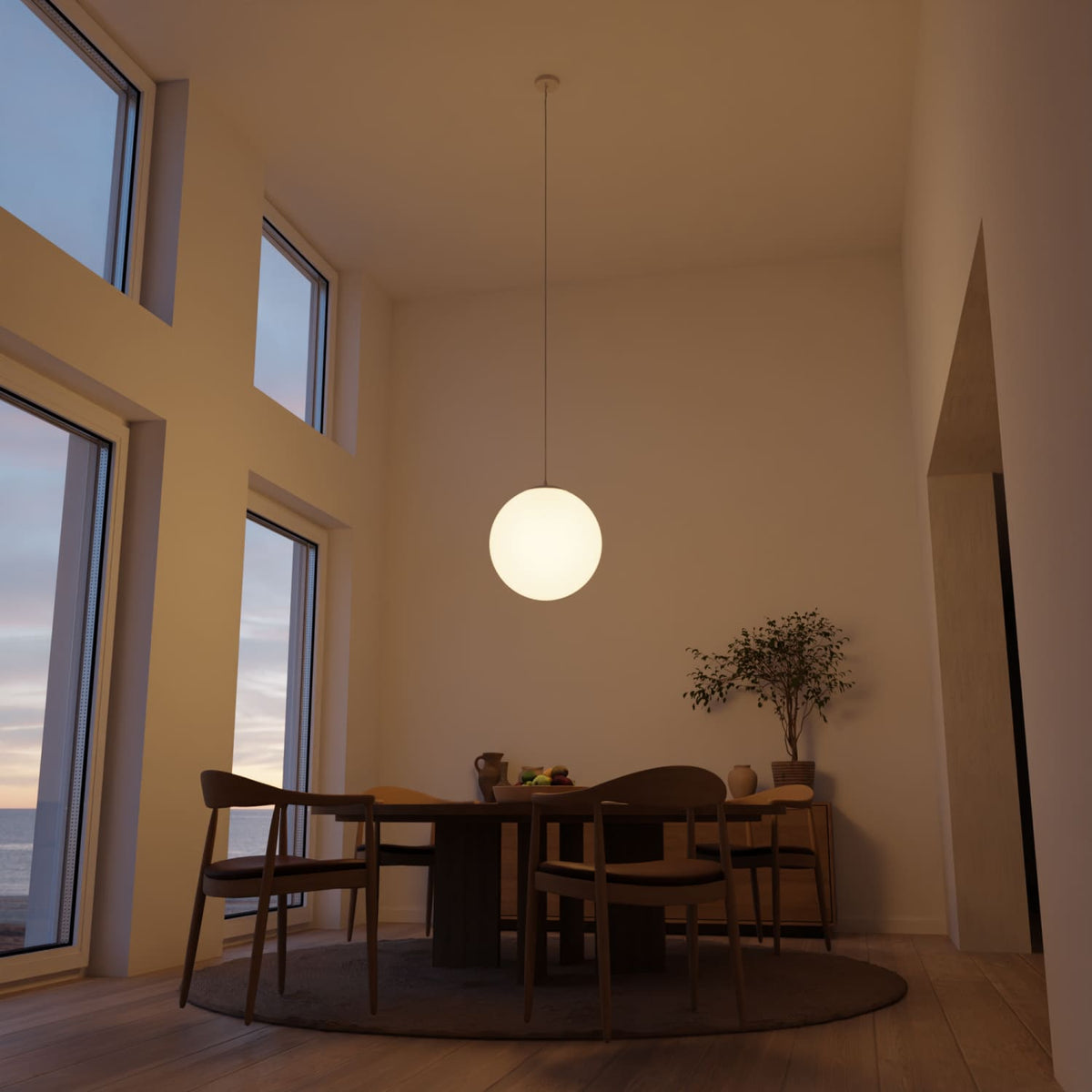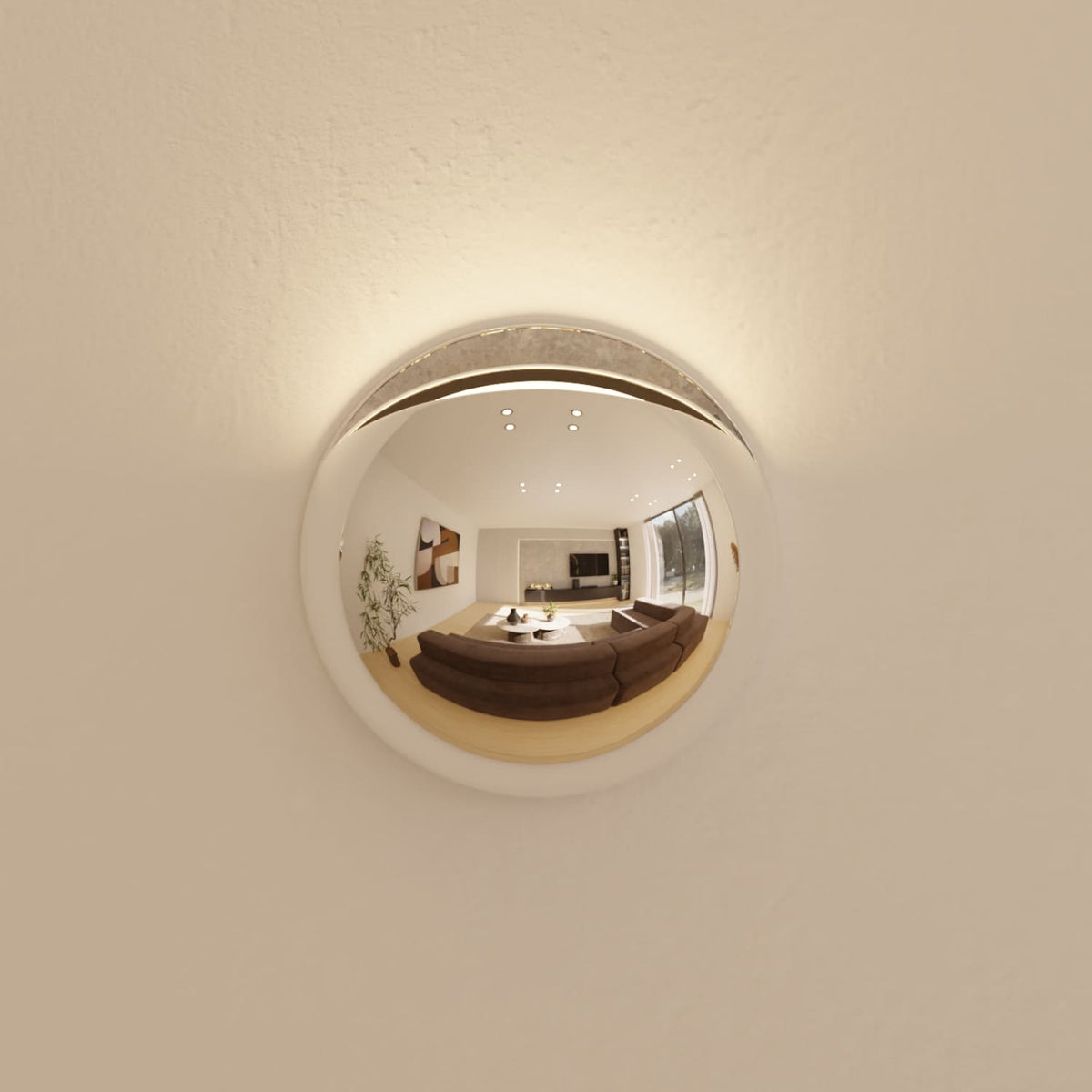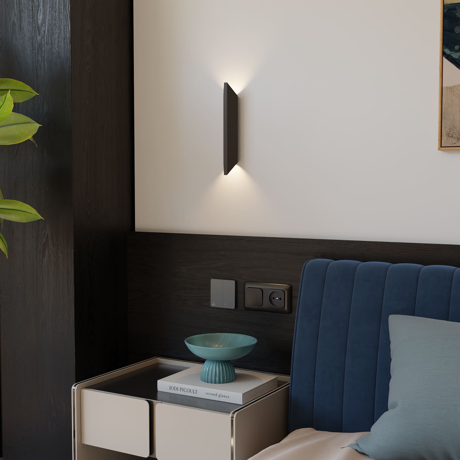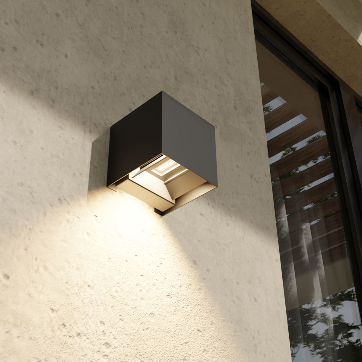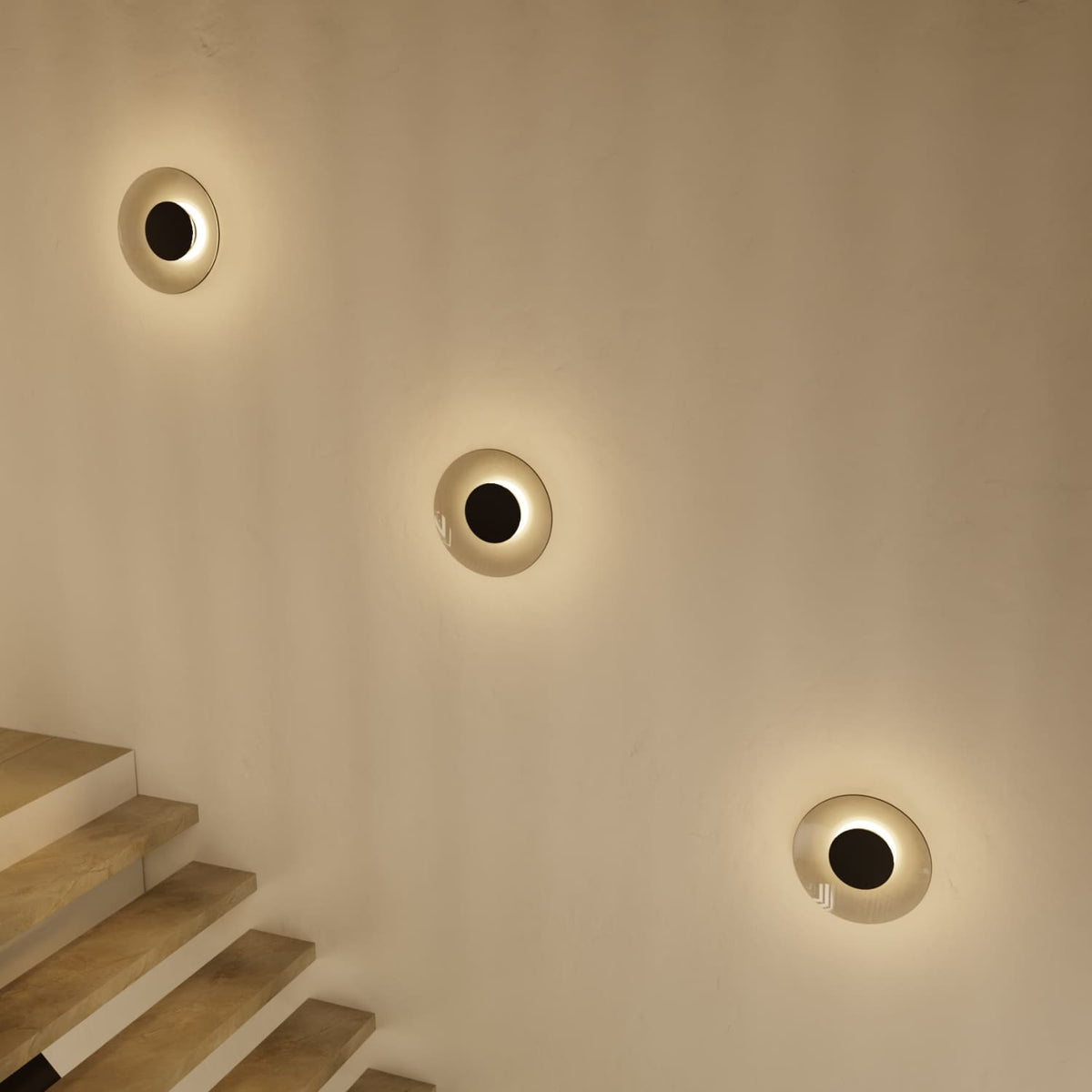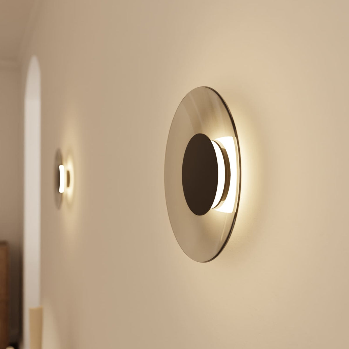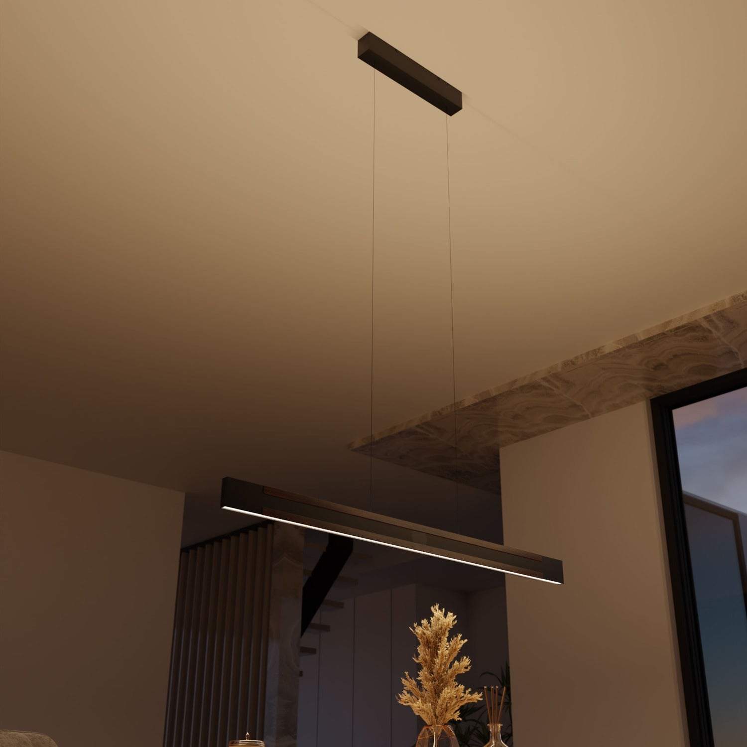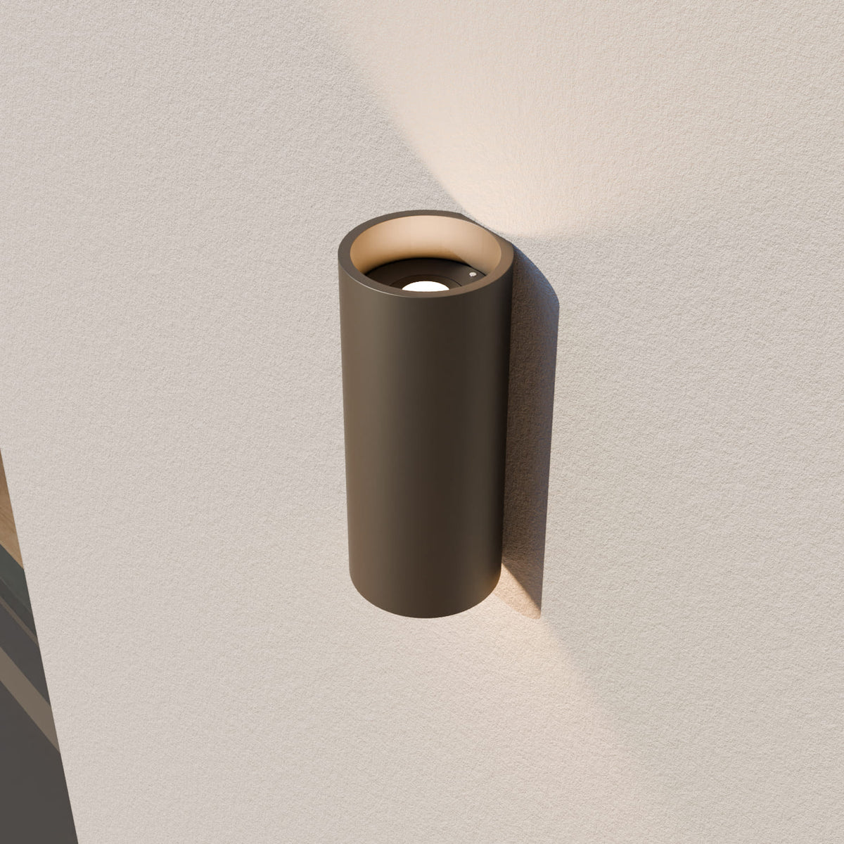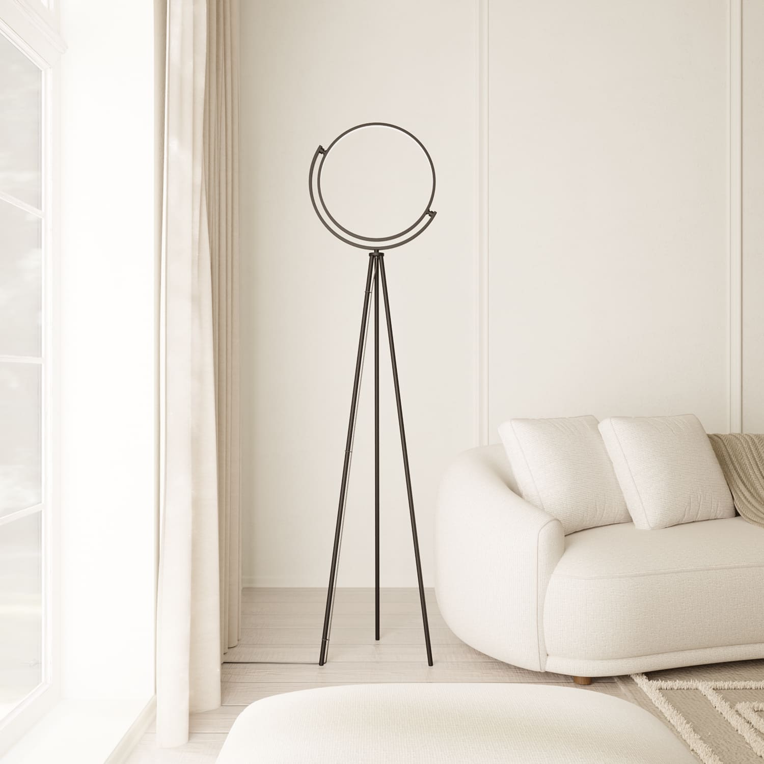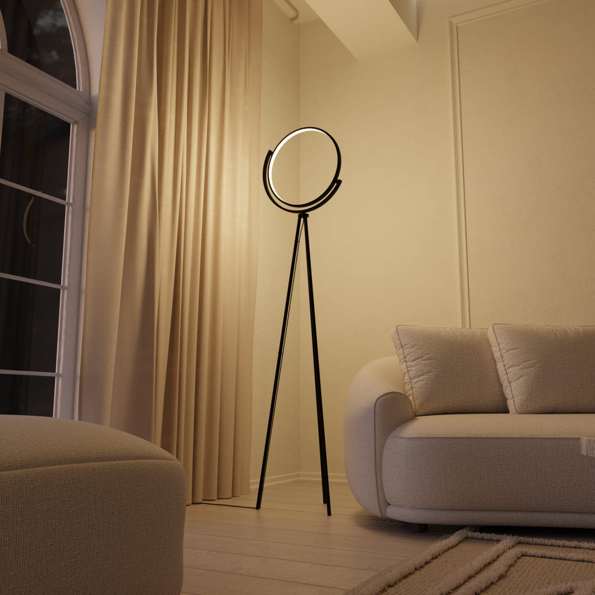


You bought a new lamp. It looks great, and the light is pleasantly warm. And yet your furniture, your food, and your favorite sweater somehow look dull. Washed out. As if someone had cast a faint gray veil over your home.
That’s no coincidence and no reason to doubt your taste. The culprit is a small, inconspicuous number that hardly anyone knows about and that almost everyone overlooks when buying a lamp: the color rendering index.
Over the next five minutes, we’ll turn you into someone who asks the right questions in a lighting store.

What the Color Rendering Index Really Means
The Color Rendering Index, or Color Rendering Index in English, abbreviated as CRI and often also given as the Ra value, answers one fairly important question: How honestly does a lamp show you the colors of your belongings?
The idea behind it is simple. Sunlight is considered the standard for “perfect,” because daylight shows colors as they really are: the full picture, nothing enhanced, nothing lost. This ideal is assigned the top score of 100. Every artificial light source is measured against it, and the closer it comes to sunlight, the higher its CRI.
A value of 100 therefore means that colors look under this lamp exactly as they do outside in the sun. A low value means your lamp is cheating. It simply leaves out parts of the color spectrum, making your tomatoes look as though they’ve had a bad week.
How the Value Is Measured
A series of standardized test colors is illuminated once with the reference light source and once with the lamp being tested. The differences between the colors are then examined. The smaller the difference, the higher the value.
Here’s one detail that takes you from novice to expert: The common Ra value only takes the first eight, rather pastel-colored, test colors into account. The saturated, vivid red known to experts as R9 is not included in the standard value at all. Two lamps with an identical CRI of 80 can perform completely differently for R9: one makes skin and food look gray, while the other makes them look vibrant. Vivid red is therefore the real supreme discipline—the factor that determines whether light is truly good.
Which Values Are Good—and Which Disappoint
Here’s the guide you can use:
Below 80 – inadequate. Colors look dull and grayish. You’ll rarely encounter this in living spaces with lamps from reputable brands, but with no-name products that provide no specifications at all, you should expect the worst right here.
80 to 89 – good, the standard. A CRI of at least 80 is considered standard for homes, offices, and living areas. The EU requires at least 80 for indoor lighting, so this is the legal minimum—not the top tier.
90 to 94 – very good. This is where things start looking truly beautiful. With CRI 90, skin, food, fabrics, and wood look natural. It’s the threshold that separates functional lighting from genuinely high-quality lighting.
95 to 100 – excellent. The premium class. CRI 95 is in demand wherever color is a working tool: in museums, art galleries, photo and video studios, or operating rooms. For your living room, it’s almost more than you need, but certainly a pleasant luxury.


Can You Even See the Difference? Yes, Clearly.
Here’s the honest answer up front: The difference between 80 and 90 is clearly visible to the eye in a direct comparison when both lamps are hanging next to each other in the same room.
With CRI 80, colors look acceptable but desaturated, especially shades of red. With CRI 90, color fidelity is noticeably higher, and the difference is clearly visible to the naked eye. The classic example is a red apple: under an LED with a CRI above 90, it appears almost the same shade of red as it does outdoors in the garden under daylight. Under weak light, on the other hand, it looks more like rusty brown.
The subtle differences at the very top, such as 94 versus 96, require placing the lamps side by side and looking closely. In everyday life, you’ll notice little difference. The big, noticeable leap happens between “below 80” and “90+.” That’s exactly where the line lies between “somehow dreary” and “that’s how it should look.”
How a Good CRI Changes Your Home
Enough theory. Here’s how it affects real rooms.
In the kitchen, food looks fresher and more appetizing. Tomatoes appear a richer red, lettuce a crisp green, and this enhances not only the appearance but can even stimulate your appetite. Anyone who has ever chopped vegetables under poor lighting knows: You can only recognize freshness when the light is honest.
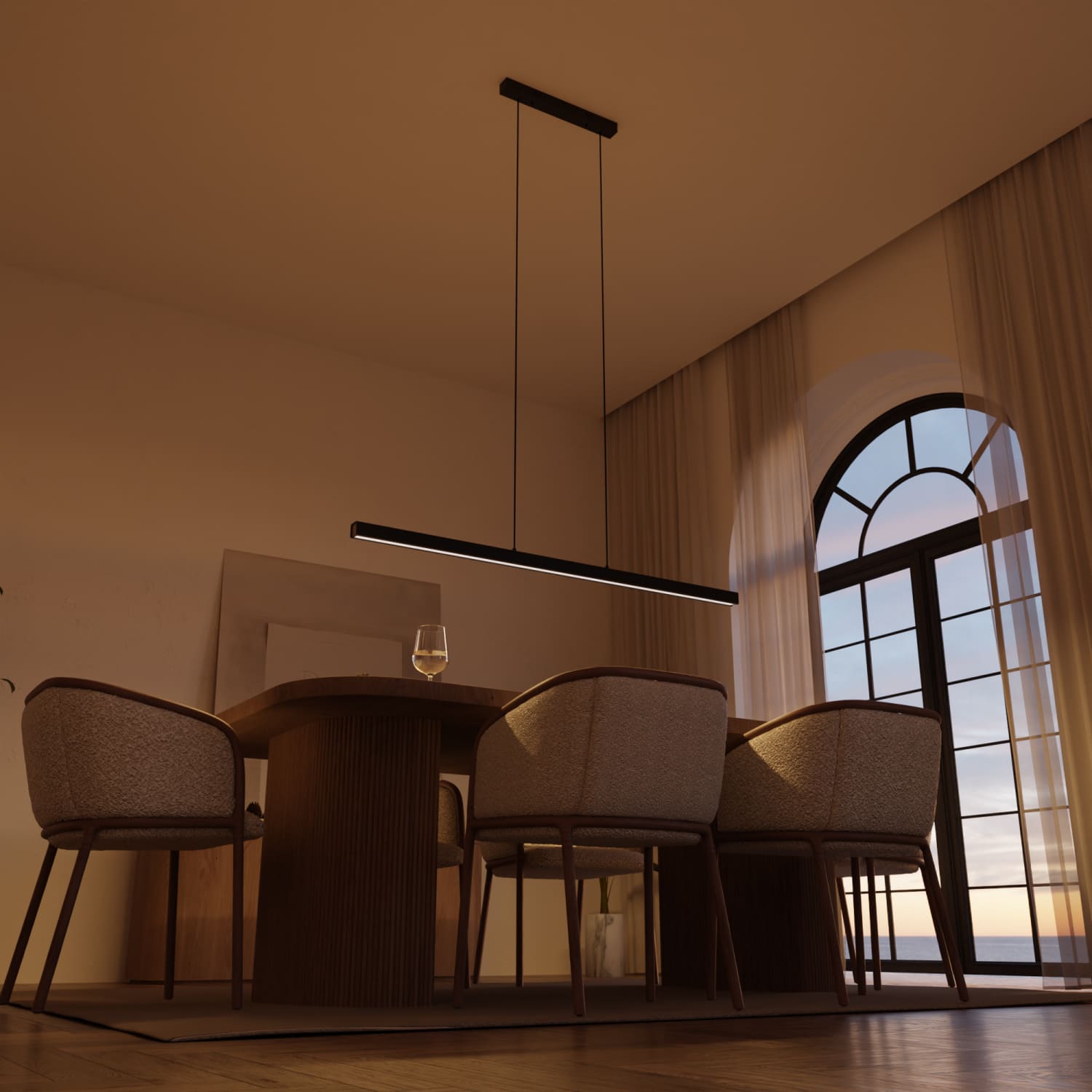
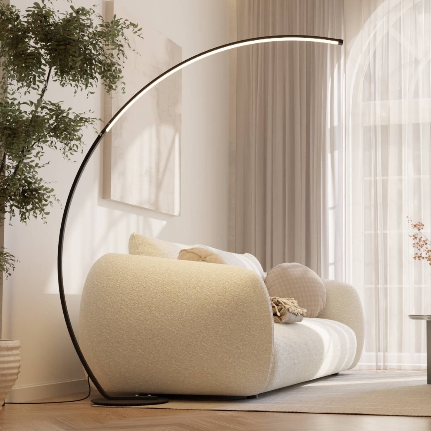
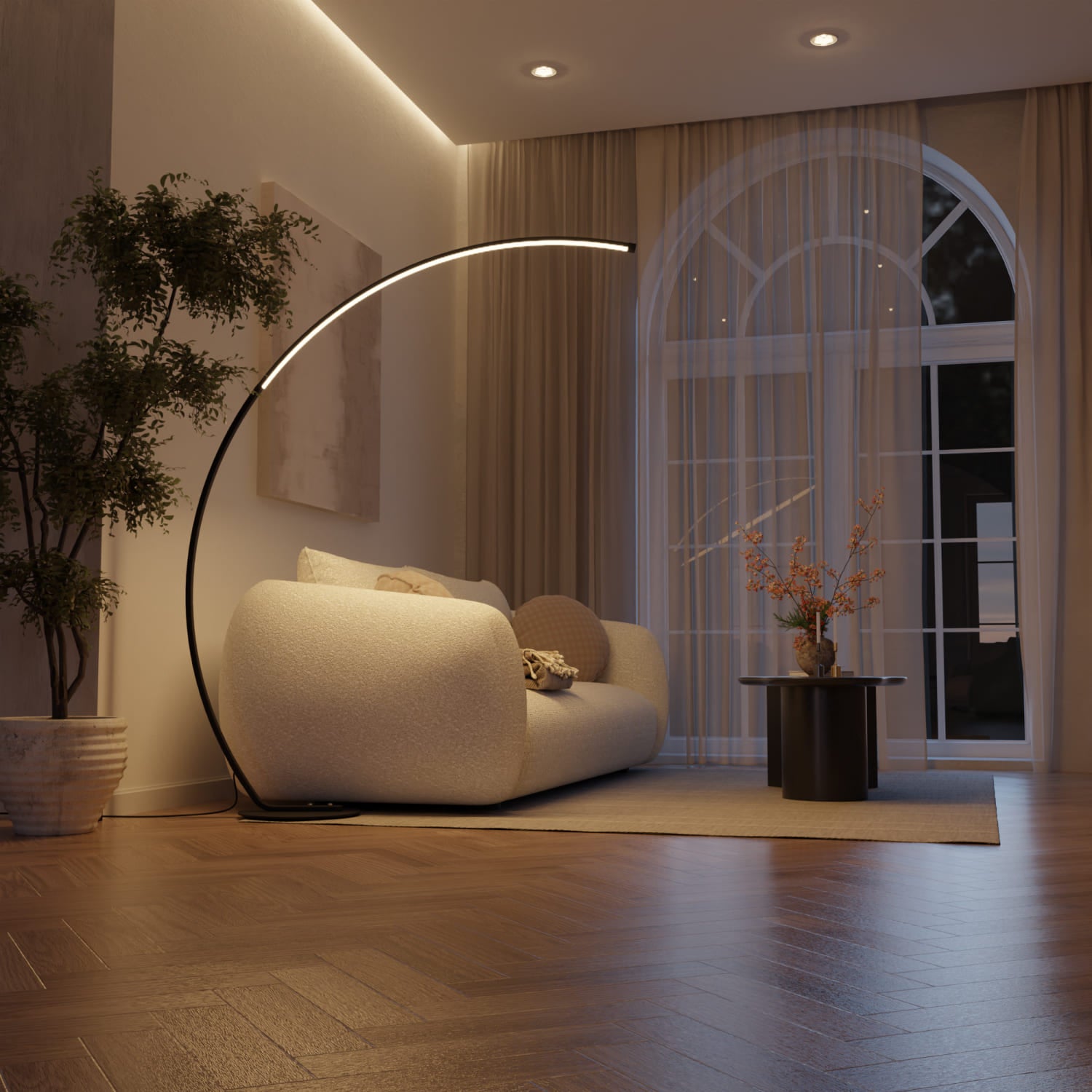
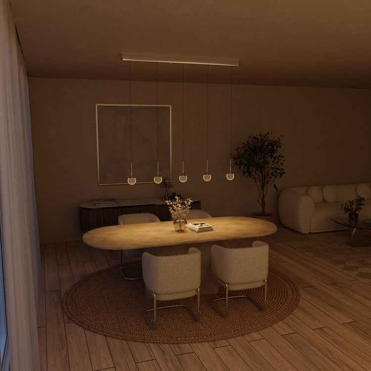
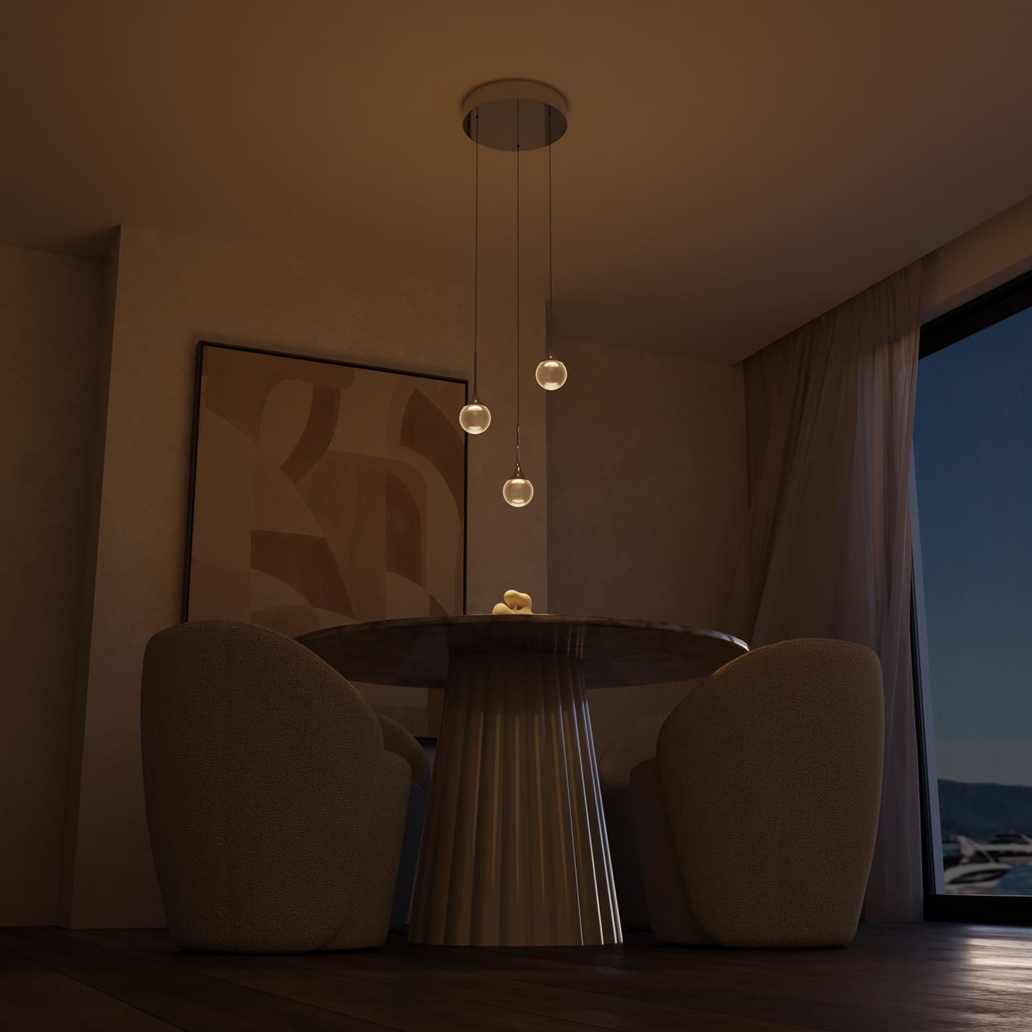
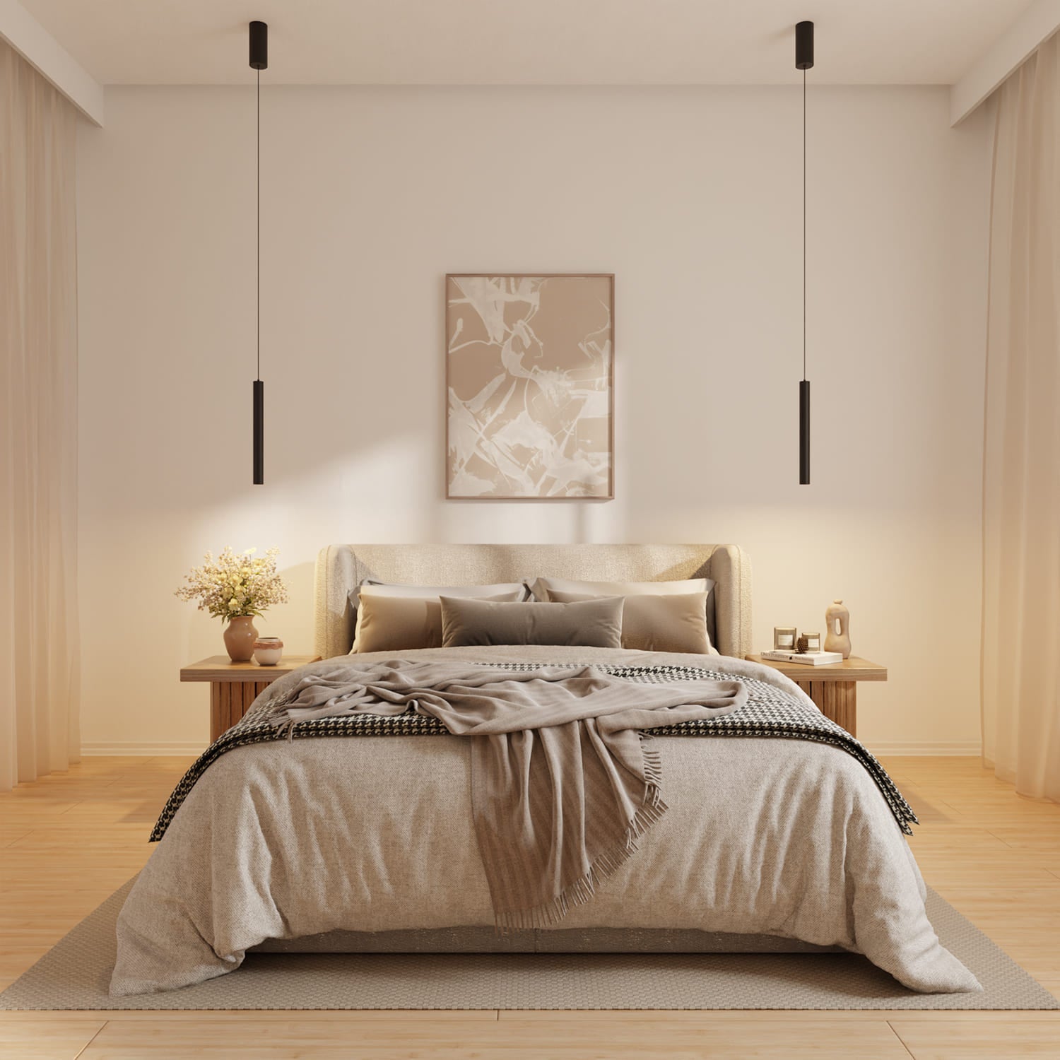
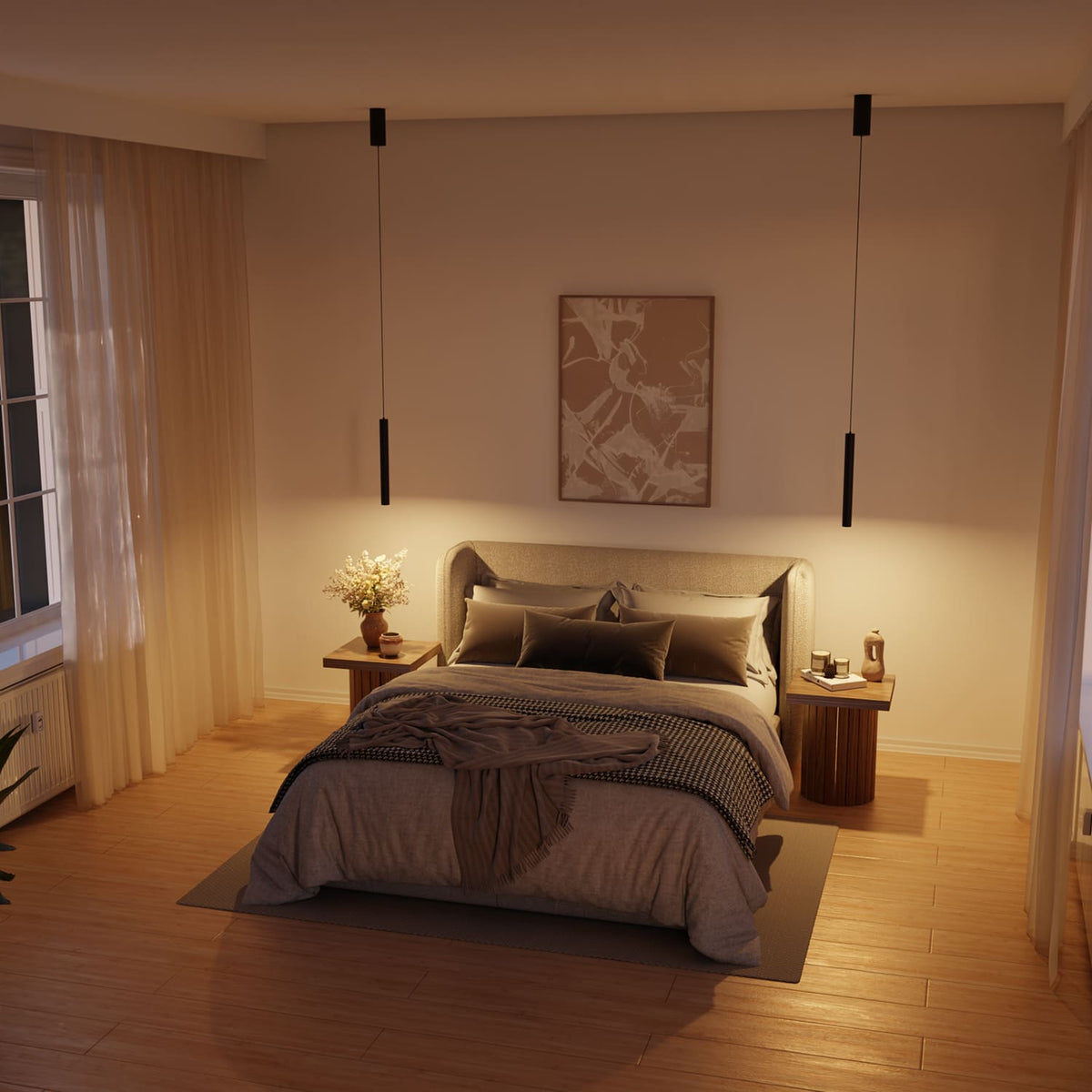
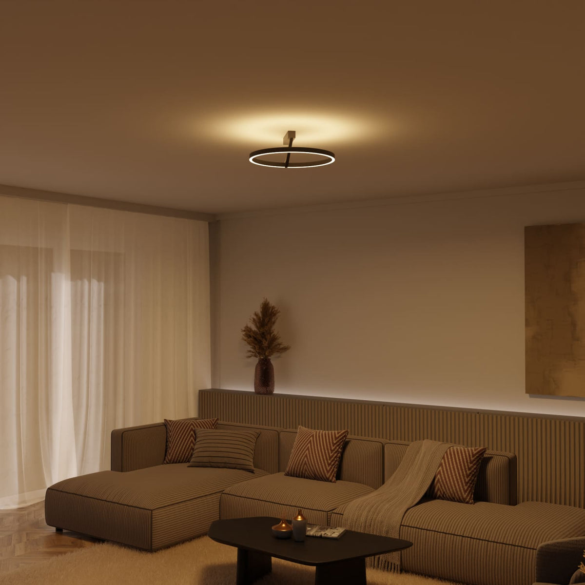
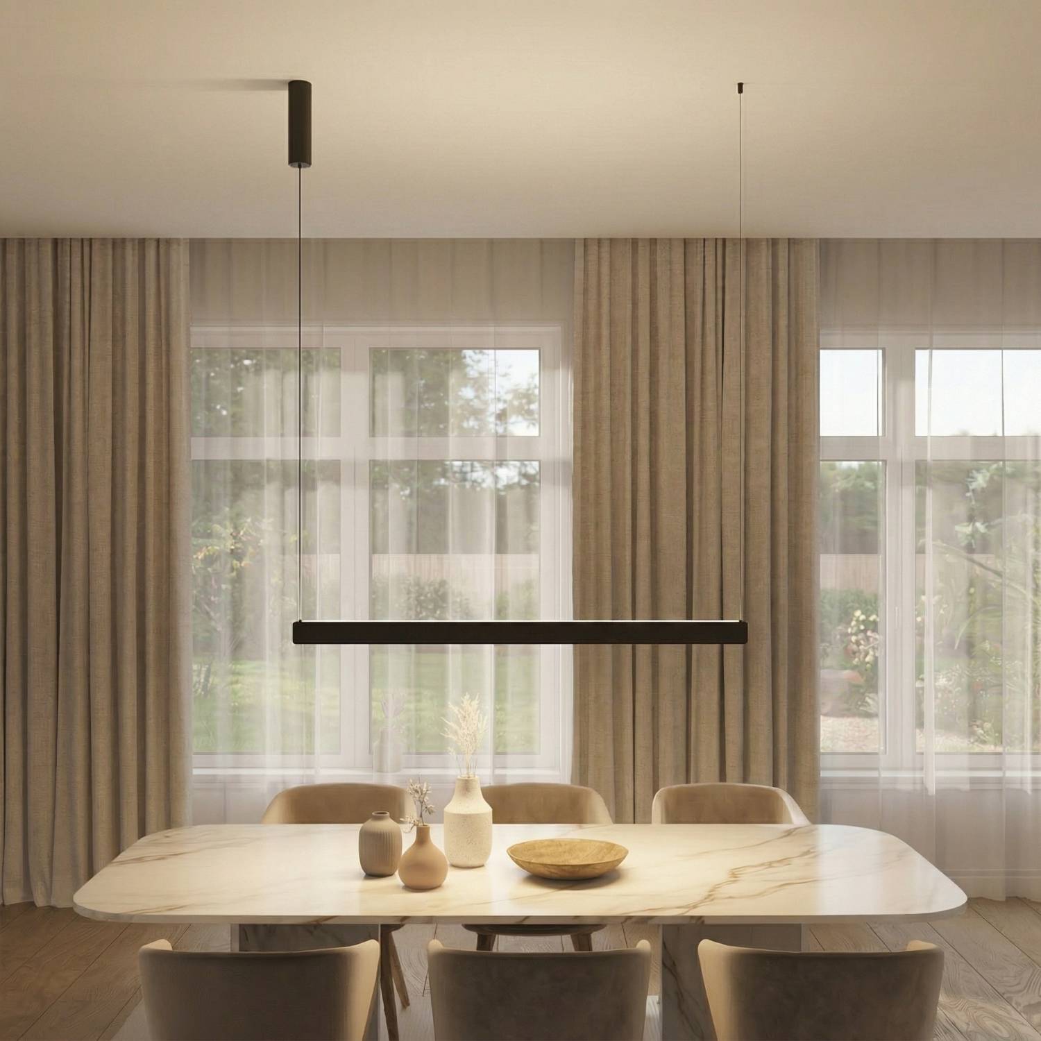
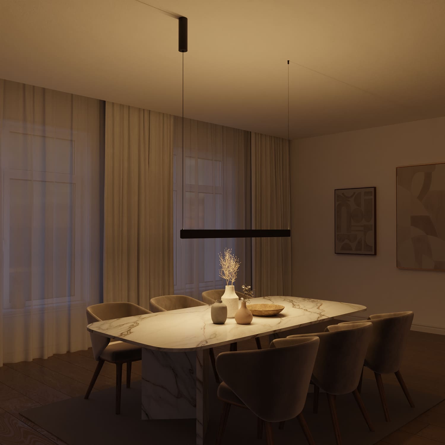
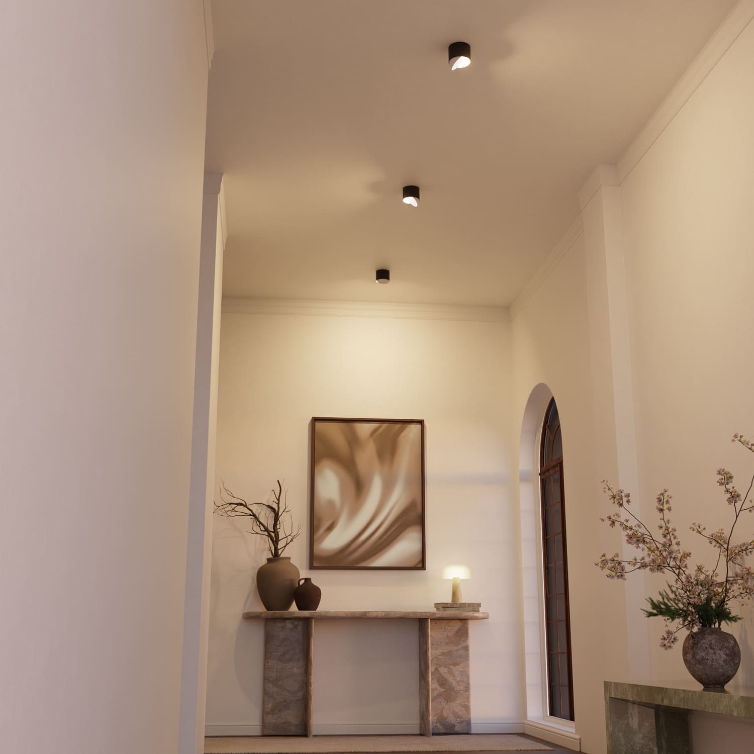
In the living room, your furnishings and favorite pieces come alive. A high CRI makes furniture, decor, and wall colors look more vibrant, making your home feel cozier and more harmonious. The expensive wall color you spent ages choosing finally gets to show what it can do.
In the bathroom, you don’t want to look in the mirror and appear pale, as though you’ve just spent a sleepless night. If you apply makeup or shave, you should choose CRI 90+, because only then will you see your true skin tone instead of a washed-out version of it.

Is the Extra Cost Worth It?
That depends on what you need it for. A value of 80 is perfectly sufficient in the garage or storage room. There, the only goal is to find the cordless screwdriver again.
But everywhere you actually live—where you eat, relax, welcome guests, or look in the mirror—good CRI isn’t a gimmick. It’s the difference between “okay” and “really beautiful.” The best part: Thanks to modern LED technology, you no longer have to spend a fortune on high values or make compromises on energy efficiency.
In other words: You’ve invested money in beautiful furniture, quality colors, and thoughtful decor. A lamp with a low CRI ruins all of that because it shows you only a desaturated copy of your own home. A high CRI is the comparatively affordable finishing touch that allows everything else to shine.
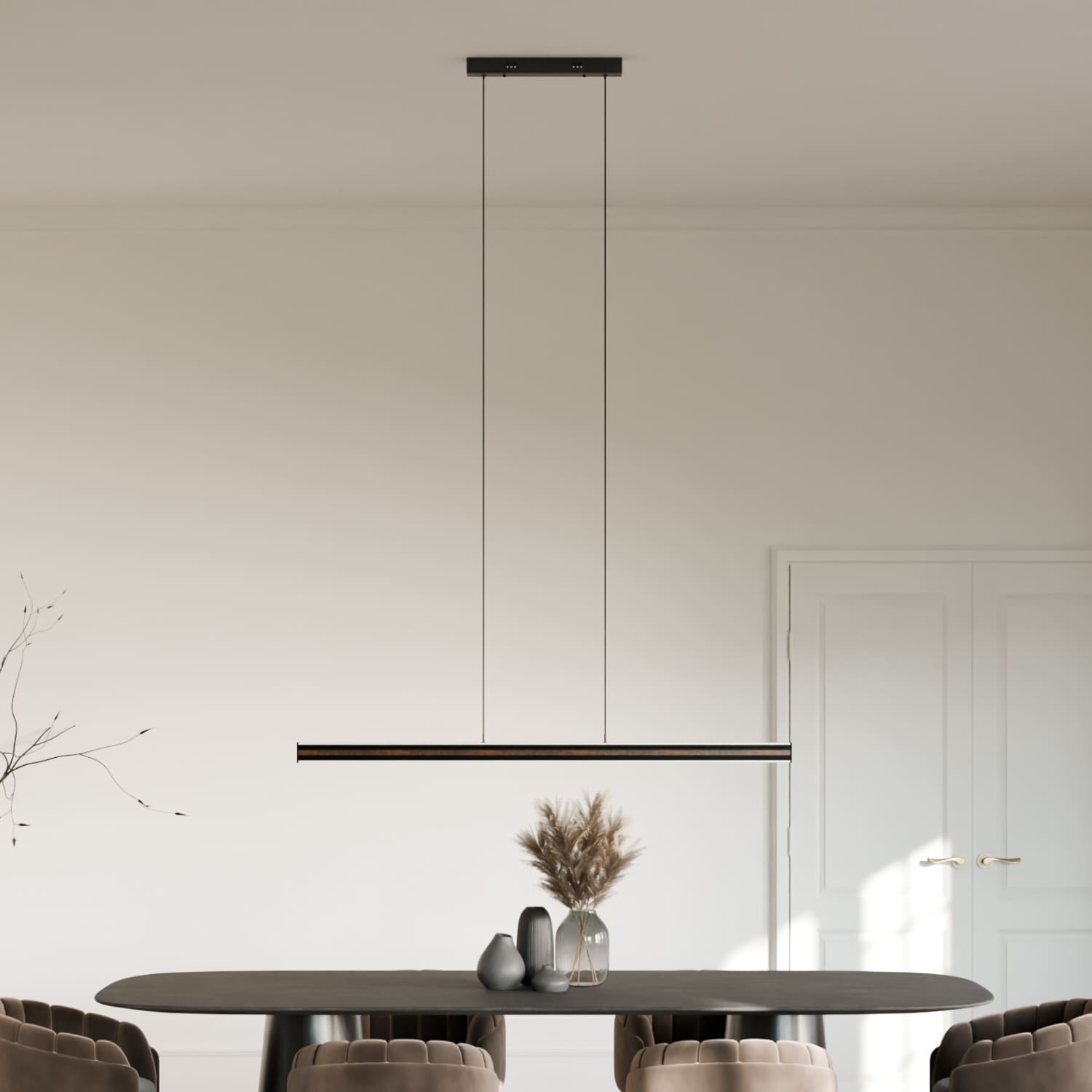
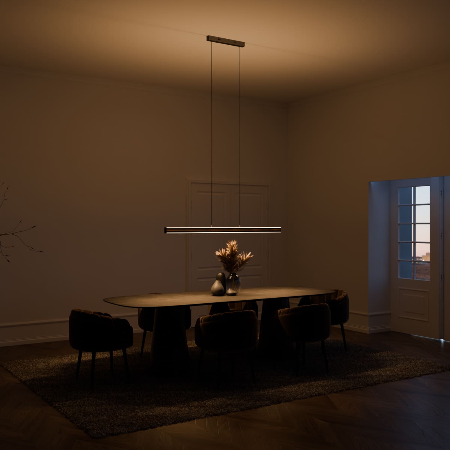
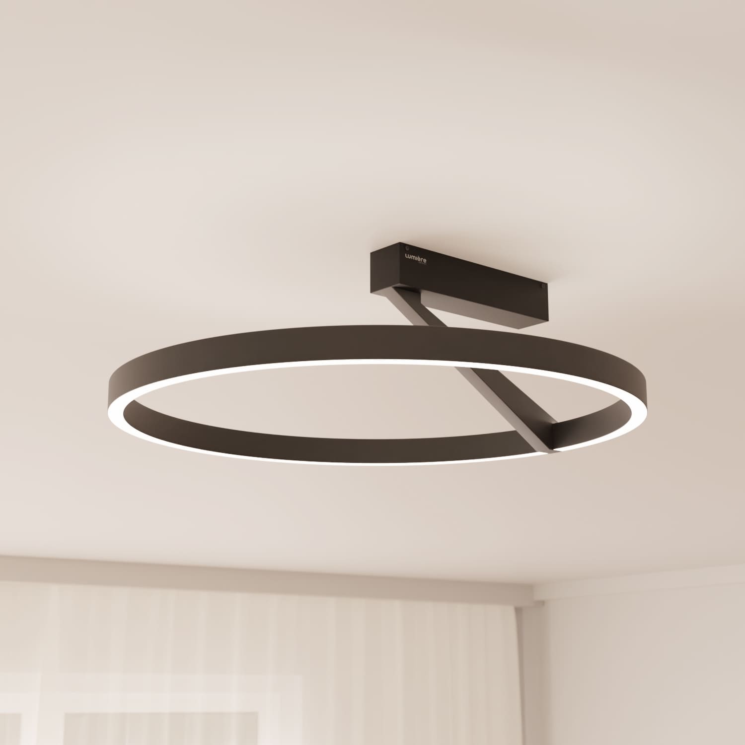
And Where Do We Stand at LUMIÈRE?
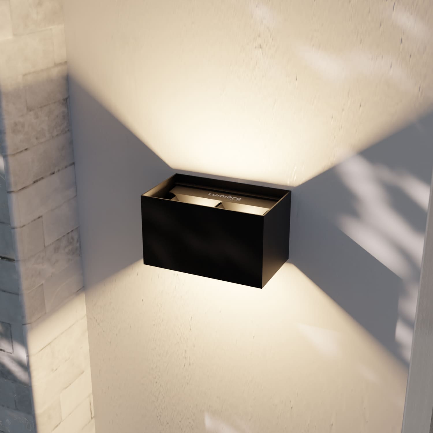
Now that you know all this, we’re allowed to speak briefly about ourselves. This time, you know exactly what the numbers mean.
Nearly all our lights achieve a CRI of 90+. Many even reach 95 or 96 in laboratory reports, but for consistency, we deliberately list them as 90. We’d rather understate and impress than do the opposite.
How do we achieve this? We use only high-quality manufacturers for our LEDs, such as Lumileds, an LED specialist with roots at Philips Lighting and one of the most respected names in the industry. As a Signify EnabLED partner (Signify is the current name of Philips Lighting), we also use almost exclusively components certified by Signify. That isn’t a marketing label—it’s why your tomatoes look like tomatoes when lit by our products.
Feel free to take a look around now, with the trained eye of a budding lighting expert.